Parallel lines and Leonardo da Vinci
Wednesday, August 30, 2006

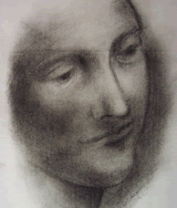
Leonardo da Vinci was said to be left handed and dyslexic. None of these two facts are relevant when admiring or discussing his work, but his left-handedness should explain the direction of the lines in his shading technique: if you have noticed, in most of his drawings the direction of the lines go from top left to bottom right.
In truth, there is no particular reason why anyone should care what shading technique he used, unless you are looking at his drawings in detail and are trying to copy them.
Copying and shading some of his drawings becomes quite awkward for me, because I am right handed and shade the total opposite: from top right to bottom left. (Not to mention that they are perfect and considered master pieces in their own right.)
One more thought that came to me while thinking of the direction of the shading lines was that of relative points of view. For example, does the world look the same to a short person compared to a tall person? So in this context, would we have considered his sketches differently had he been right handed? (Why would anyone think of this, I don't know but indulge me.) In the end, shading is shading and it gets interpreted by the brain as a shadow anyway, however, the mood of the drawing would probably change depending on these parallel shading lines.
Think of how we deal with the world: parallel lines seem to be more pleasing and easier to absorb than a set of lines randomly put together. Moreover, the direction of the lines matter: our eyes are trained to interpret patterns and parallel lines tend to mean or point to different things, for example, when I see parallel lines I think of man-made or artificial stuff, as nature doesn't put things in perfect parallel lines too often, and it definitely doesn't use lines to represent shadows. (So these lines are just tricks of the trade.)
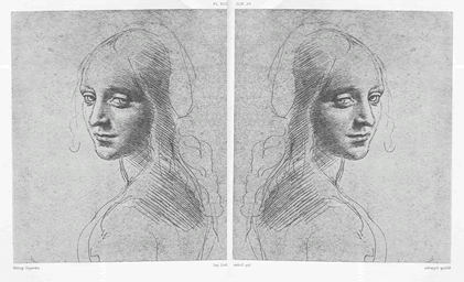
Anyway, I tried a little experiment and reversed one of his drawings. This is what I got:

Not too much changes: the drawing is still quite beautiful, but perhaps this is a much too simplistic drawing to really feel the difference. Oh well, I guess we'll just never know.
By the way, you can read da Vinci's notebooks
on-line. (That's too prove that the "internets" are not just about spam and pr0n.) A few years back, I got the chance to actually look at a few pages of the originals. Although it was through a glass cover at the ROM, it was quite a humbling experience.
On a final note, it would be insulting of me to assume that using the same technique he used would yield comparable results. However, his technique is copied all around and should be copied all around.
Comments: