Gabriel's Video Game - Part 1
Monday, January 26, 2009
Yesterday night, Gabriel, my 8 year old son, asked me how video games are made. I explained a bit of the process as follows: someone designs them and someone programs them; once they are completed, they are ready to ship and people buy them. In the middle of our conversation he said that he wanted to make his own game. I told him that he could do as he pleased and that after school the next day he could start his game. I told him that I could help but I wouldn't actually make the game for him.
Today, as soon as he came in from school asked for paper to start designing his game. I didn't time him, but the whole process took him around 30-45 minutes. He even has a title for it,
Heven's death way--we must rise. He also has a map of the game, a few weapons, a place where to save his game, and a couple of action shots. It's a pretty complete software specification, by any standards.
I will post the game specifications below. They are all done in pen an paper--it's never too early to have him working within a proper software engineering framework. First, however, I want to explain why I'm recording this experience.
I'm not sure how far he'll get, but I hope he finishes it. I'm absolutely staying away from the creative and implementation phases. This is his project, not mine. I'm just trying to facilitate the process and I'm trying to find him the right tools. Therefore, everything he's come up with this far is his own: I haven't given him any recommendations or feedback on his documentation. I'm sure he's gotten some inspiration from somewhere, but I don't know from where. The point is that nothing he's created has come from me. In general, I try to stay away and not influence his decisions too much--it's very hard, but I try. It'd be too easy to get carried away.
When I was his age, things were different. In fact, I didn't actually touch a computer until I was 17 years old (in late 1989). Like I said, things for him are different: he's part of the Millennium generation. These are kids who grew up and are growing up with their own laptops, high-speed internet, the latest game consoles, Club Penguin accounts, online chatting, Google, YouTube, weekly trips to bookstores, no television (cable or satellite TV). The list can go on. Needless to say, these kids are connected and are truly the future of what's to come. I'm sure that whatever this generation will invent will be just incredible. To us, the things that we do (the things that I do for a living) are extremely cool, but these kids will expand on what we are currently doing and taking the net to places we can't even imagine today. We think Facebook is revolutionary--this "Web 2.0" meme will be nothing compared to their inventions.
So what's next, now that he has the map of the game? I'm trying to look for a 3D rendering engine that he could use--like I said, I don't want to do anything. He also needs to create a few characters and give them names (I think he has some already). He has the story, I just need to understand what it is so I can help him put it into the engine. By the way, does anyone have any recommendations? If you do,
email me.
What I find surprising is the sophistication of his design. I take a look at his 3rd grade school homework and nothing they do in the classroom compares to what he's created. I think it's a pity, as our educational system hasn't caught up to the times--we'll suffer for that. I think most of what he's done comes from the games he plays and the surfing he does--he likes game publisher sites with lots of videos.
I have to put a disclaimer here: Gabe is a normal kid, and I'm not trying to create a mini-me (2 of me would be great, but this is not the right way of going about it). He does more things than just play video games and surf the net. For example, he plays baseball and soccer (we'll try again this summer--fingers crossed), swims from time to time, plays chess, takes piano lessons, collects rocks and sticks (don't ask), reads, has a journal (I think this one is weird, even I don't have one), etc., etc. You know, the typical kid stuff.
Another theory I have about his diagram involves me working from home most of the time: I typically have a few design documents opened on my computer screen, and he may have seen a some of them--because of the connectedness of the missions. Who knows, but I'm certain most kids his age could create what he has done: these connected kids have access to a lot of information and have learned to digest it fast and effectively and, most important, apply what they learn to problem solving.
If you are still reading, here is the documentation he has created:
Splash Screen (all games have a splash screen)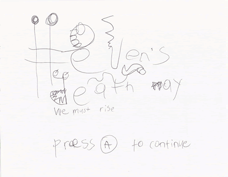
I'm still not sure how he arrived at the name. I googled the full sentence, but no results. Note that "heaven" is misspelled, but I'm not sure if the mistake is not actually intentional (kids and txting). The gratuitous artistic touches clearly serve a marketing purpose: cool sells (that's how I interpret it, anyway).
The Game (with the levels and details of levels)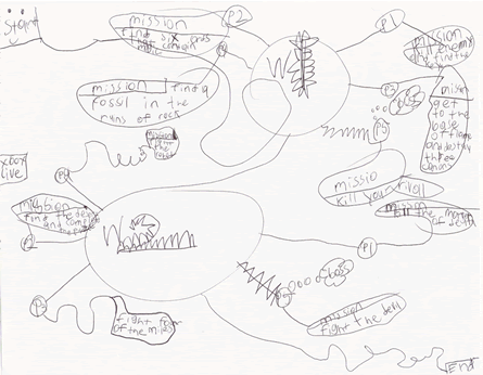
Note that the game has a start and an end. You can clearly see the connection to different levels. I also like that the challenges in each mission are different, e.g., in P4 you have to "find a desert and solve the puzzle." In the final level you have to fight the "devil" (I'm not sure what he means by that, but my guess is that the devil is similar to a Wii's Guitar Hero character). What I'm most impressed with is the "Xbox Live" button: he knows that players can connect to other players on the internet (he challenges other Guitar Hero players on the internet all the time). He's a kid of the times, that's for sure.
Cool Weapons (what game is complete without them?)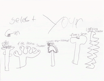
Each weapon or gun has a specific name. My favorite is the "funny gun"--I haven't asked him what this gun does.
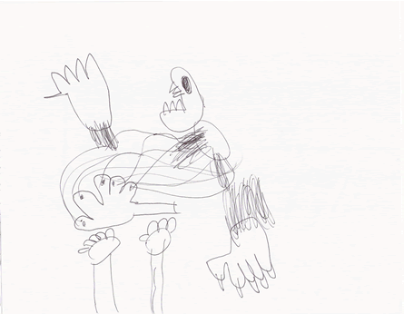
Battle Detail (1) Battle Detail (2)
 Saving a Game (you should save your game)
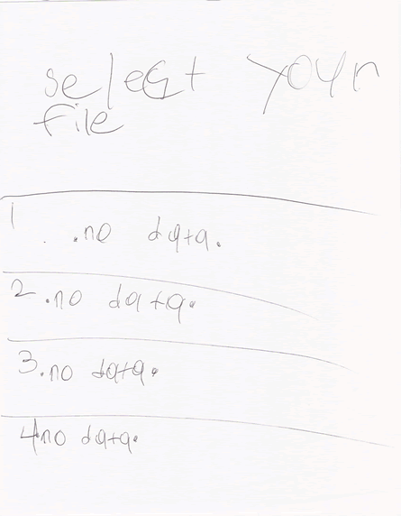
He's very cognizant of the fact that players need to save games. He gets really mad when he has to brush his teeth and we keep asking him to go do it, when we know that he has to reach a point in the game where he can save everything. I'm not sure why he picked 4 "data" slots--perhaps that's what Wii games offer.
I'll keep an eye on his progress and post it. If he ends up creating a binary, I will post it, too, for beta-testers.
I think the whole point of him wanting to create the game is to sell it, but we'll see how it goes first. I will have to review his business plan first and monitor the quality of the game. :)
Golden Ratio and Rectangle Calculator
Thursday, January 22, 2009
If you are like me, you like the golden ratio. In fact, if you are like the majority of people, you like the golden ratio. Presumably, it is the most pleasing rectangles there is.
When I was a kid, I wanted to know how to find golden pairs, i.e., the 2 lengths that make a golden rectangle. The math was over my head then; however, thousands of dollars later, a few years in University, and a few sleepless nights I can now handle it. The whole thing is based on the fact that the golden ratio is defined as follows:
1/x = x/(1+x)When you solve for x, you get (1+√5)/2, which is about 1.62.
Therefore, if you want a goldenized pair, multiply or divide the value you have by 1.62, depending of which side of a rectangle you want. For example, if you have 100 as the width, then the height is 100/1.62 = 62. If you want 100 as the height, then width is 100 x 1.62 = 162.
The simple rule is:
if you have the width and want the height, divide by 1.62; if you have the height and want the width multiply by 1.62.Yes, I was a bit bored. Too much reading and writing and not enough coding today...
Word clouds are neat
This is what my
RSS feed looks like:
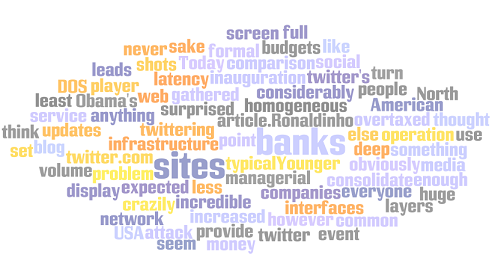
Created with
http://www.wordle.net/.
Bank web sites and UI consolidation
Wednesday, January 21, 2009
We think of banks as very formal companies, with deep managerial layers and huge operation budgets. I never thought, however, that because of the homogeneous service they provide (anything to do with money) they would consolidate their web sites' interfaces.
I gathered a few screen shots of some North American banks for the sake of comparison: they seem to have something in common, don't they? They seem to have similar template and tabbing separation of content. I admit that it's hard to separate a lot of content in web pages in anything but tabs; however, I don't understand why they all decided to use the same style.
Perhaps it has to do with not wanting to be
too different, which at first sight seems to be a mistake: why not be different and be the coolest bank site ever?
No one can dispute banks' web sites can create competitive advantage; Bank executives know this. However, the issue is that the switching cost for customers is too high: pretty web sites don't get customers to deposit their money in any particular bank. What's more, a bank's web site can be leading edge and be the most function-rich application in the history of the internet, but if no one goes to the site it doesn't really matter how well designed it is. For example, it's very unlikely for me switch to a different bank just because bank "X" offers me a better online banking experience. I make due with what I have, because I kind of have to. And I'm not in the minority: a bank preference is a lifetime commitment.
The question I'm trying to answer here, however, is why do the sites look similar? For this, I'm bringing in one of the concepts of game theory: the UI consolidation that I'm pointing out here seems to follow a
Tit-for-Tat strategy. These sites are public, and I'm sure that bank designers and IT departments snoop around each others' web applications. So if one site offers a really good function, others banks are likely to follow a few weeks later. It's part of competitive behavior.
So the issue is that not many banks want to be leaders of the pack in terms of having the coolest site, because it costs a lot of money to be leading edge. More important, the returns on investment are not guaranteed. Like I said, bank customers are unlikely to switch to a different bank because of their web site. Therefore, banks spend just enough not to drive their clientele away from their services.
Which brings me to the WUI (web user interface) consolidation: first, most banks are just good enough and don't have to be better than the competition; second, not many banks want to be the top-dog for the fear of being too different and for the fear of spending too much money that will not result in client attrition.
I say that there has to be a balance: dare to be different, but cost conscious. In the end, it will pay off.
For your pleasure, here are the screen shots of my survey:


Note that this is not a formal survey, and I don't work for any of the organizations mentioned here. I have, however, worked on some sites for the Bank of America (through
Organic) and other web application for some banks in Canada and the US, but not as a designer.
Improving Twitter's loading time in your blog or site
Tuesday, January 20, 2009
If you are like me, you have twitter set up to display your updates on your blog.
Today is Obama's inauguration and obviously enough we are crazily twittering about the event. This leads to twitter's infrastructure to be overtaxed and network latency has increased considerably, to the point of twitter.com being down (more or less an expected DOS attack).
Why is this a problem?
The typical twitter set up looks as follows:
<ul id="twitter_update_list" style="list-style: none; margin-left: 0; padding-left: 0; margin-top: 0;"></ul>

<script src='http://twitter.com/javascripts/blogger.js' type='text/javascript'></script>

<script src='http://twitter.com/statuses/user_timeline/josesandoval.json?callback=twitterCallback2&count=1' type='text/javascript'></script>
This is a problem because this code blocks the whole page from loading until the twitter code is downloaded. Today this takes a while and degrades your users' experience.
However, there are options. Try this:
<ul id="twitter_update_list" style="list-style: none; margin-left: 0; padding-left: 0; margin-top: 0;"></ul>

<script type='text/javascript'>
   var head = document.getElementsByTagName("head")[0];
   script = document.createElement('script');
   script.type = 'text/javascript';
   script.src = "http://twitter.com/javascripts/blogger.js";
   head.appendChild(script);
</script>

<script type='text/javascript'>
   var head = document.getElementsByTagName("head")[0];
   script2 = document.createElement('script');
   script2.type = 'text/javascript';
   script2.src = "http://twitter.com/statuses/user_timeline/josesandoval.json?callback=twitterCallback2&count=1";
   head.appendChild(script2);
</script>
This code downloads the JavaScript concurrently with your other elements in the page--well, as many concurrent TCP/IP connections your browser allows. This means that the other elements in your site display without waiting for twitter to come back with content.
Your users' experience is not affected too much, but they will likely wait a few seconds to read your tweets.
Social Media Demographics
Friday, January 16, 2009
Younger people use social media sites more than everyone else, at least in the USA. I'm not too surprised here.
 The full article
.
For the football lovers out there
Wednesday, January 14, 2009
Ronaldinho was an incredible player (turn the volume down):
This is the story...
Saturday, January 10, 2009
On Thursday, on my way back from Toronto, I was sitting on the back of the train. Here is where the four sitter chairs are (they face each other). I like to sit there, because I can put my feet up and take a nap.
At the Brampton station, a tall oldish man went to the washroom and decided that he was going to sit in front of me. He announced it to the whole train, stating loudly: "Hey, I'm going to switch seats and sit here. Cool." I was sleeping and because he was so loud he woke me up.
A couple of minutes went by and he did indeed sit beside me; I smelled him, and I knew it wasn't going to be a pleasant trip: he smelled like a crazy person, a drunk crazy person. He started talking to me, but I'm not the most social person you could meet on the train, so I glanced at him and went back to sleep.
As he continued drinking 4 beers in 30 minutes, he started getting really agitated. It may have been the Napoleon Brandi chaser shots in between the brewskies, I couldn't really tell. The point is that because he was crazy and now more drunk than he was 30 minutes earlier, he knew everything about everything. For example, he thought I was Spanish because I "was brown" and that "other people are brown too," but he thought I was OK--other brown people, not so much OK. Again, I glanced, and tried to go back to sleep.
Another beer later, and he started trying to pick a fight with a gentlemen sitting on the other side of the isle. Our friend's new victim had a laptop, a calculator, and some papers that he was using to make corrections on. He started saying really loud that people who use computers were "addicted" and that "we don't use our brains anymore." He gave the famous "we only use 10% of our brains" bit of wisdom. Coming from a crazy drunk person, I started paying attention: what else does he know?
I didn't have to wait long. He said that "Einstein used 11%," which I think was very exact to be random. True, he was crazy but who makes a statistic like that one on the fly? Why not 12? I mean, 11 is a prime number, and prime numbers are all right.
Then he mentioned that his daughter had given him a pair of boots (ah, he was also proud of her and his other 4 kids). He kept staring at the boots and said: "I just had an idea; a brilliant idea. Why not make boots where you can attach things to them: skis or wheels underneath. Yeah, that's a billion dollar idea. In 10 years someone will invent them, and I will say, 'Hey, cool.'" I didn't have the heart to tell him that there already were things called ski boots and wheelies, and that roller blades had been around for a while now.
Because he was belligerent and loud, no one would look at him in the eyes. By instinct we know that by looking at someone in the eyes we are trying to engage him or her. And when the other person is drunk, crazy, agitated, or any combination of all these, it likely means that someone is about to get violent: "What? You're looking at me?" Eye avoidance is a survival reflex. I, on the other hand, like to push things a bit, so I looked into the eyes of the crazy, drunk old man. Like I said, I'm a dare devil.
I didn't see anger: I saw loneliness and sadness. I saw a man trying to prove to the world that the path that had taken him to where he was (crazy and drunk) was of his choosing. The strings and arrows of his fortune had nothing to do with his current state.
At the Kitchener station, where I get off, the train attendant found his Brandi bottle in his coat's pocket. He looked at me and asked me if I had complained about his drinking? I wonder if he ever noticed me at all: in between his soliloquies I was pretending to be asleep; hence, how could I have complained? Besides, I didn't really care: this is a free country (well, kind of).
He was the talk of the train. I doubt he ever made it to wherever he was going--Sarnia, I think. Note to self: crazy drunk people get thrown out of trains.
I looked into the eyes of a man. I was not afraid. I was sadden by his pain and loneliness. Of course, I had already figured out I could take him so that made me braver than usual. As I tell Gabriel, "I can Tae-Kwon-Do your ass on command." He laughs...But he laughs at all bad words. My Gabe; we have good times. Uncultured, good times.
As I was leaving the train, he wanted me to fist-bump him. I didn't. I said, "Take it easy, old dude. Take it easy."
The Luxury Watch Economy
Friday, January 02, 2009
From time to time, I like to conduct statistical analysis of things that I find interesting. It can be anything, but most likely it will be about something irrelevant, which I can analyze in a few minutes.
Today, I completed my second data gathering point exercise on full page advertisements for luxury watches in a securities trading magazine. I got my first data point 6 months ago: out of 120 pages, there were 12 full page ads about luxury watches: that's 10% of the magazine dedicated to just watches. My second data point is from today, with 16 full page ads about luxury watches out of 124 total pages: that's 13% of the magazine.
These type of magazines are targeted to the trader want-to-be or the professional trader for whom money is not an object. The thing is full of advertisement of high-end wines, whiskey, and, of course, watches. There are a couple of interesting articles, but mostly vacuous theories on chart reading, market timing, and silly things like CAPM analysis. You also get a short bio of a famous or successful trader. Not everyone is a multimillionaire hedge fund manager, but the pictures of the traders (all of them mostly men) seem to have 2 things in common: Brioni suits and luxury watches.
Again, this is a pointless observation, but I haven't quite understood why this particular segment of the population is so hung-up on luxury watches. Maybe it's one of the first things people notice: the watch.
I understand that the suit and the watch are part of the aura of success that has to surround this industry. This is nothing new, and we've seen it played in history countless of times: over accessorizing to portray status. Quentin Bell writes in
On human Finery, "The history of fashionable dress is tied to the competition between classes, in the first place the emulation of the aristocracy by the bourgeoisie and then the more extended competition which results from the ability of the proletariat to compete with the middle classes....Implicit in the whole is a system of sartorial morality dependent upon pecuniary standards of value."
With this in mind, it shouldn't be so surprising that as we try to emulate more successful people than us we start to dress, act, and talk like them. Marketing and advertising, as sciences of selling, exploit this evolutionary trait at every opportunity. That's not to say that we shouldn't try to understand what makes successful people successful. My point is that there is a difference between mentorship and mimicry, which can lead to plain idolatry.
This banal attempt to sell overpriced watches reminds me of the character Patrick Bateman in the 2000 movie
American Psycho, played by Christian Bale, when he studies his friends' business cards with excruciating detail trying to figure out if his cards are made with better paper and ink. Both sound so shallow, as we know better; what's more, I'd think that we're trained to spot the smoke and mirrors when placed in front of us. But perhaps not, as we've have come to understand that expensive clothing, jewelry, and accessories are symbols of high status.
Finally, in my analysis, I only look for luxury watch ads; the actual content of the magazine has close to 50/50 ratio of ads vs. content. Maybe that's another quick data point I should start gathering; but maybe it's just the accepted ratio of ads and content: even The Economist and Business Harvard Review, which are considered to be more reputable among glossy publications, are full of ads for different products from oil companies, MBA schools, to weird looking exercise machines.
This watch, tacky and horrible as it is, is worth $150,000.
